The Rise of Women's Soccer - Makeover Monday | Visualise
This tableau visualisation explores the rise of women’s soccer in the US since 2003. A great visual display of the upward trend which has presumably been a strong influence in the success of the US women’s soccer team in recent global campaigns, including their win in the FIFA World Cup.
If you’d like help with understanding how best to use your data, then please get in touch.
Digital security is more important than ever, as breaches can land your valuable information up for sale on the Dark Web.
At White Box, we’re serious about two things: digital security and data visualisation. So, we thought that we’d combine them into one topic to see what insights we could find and share with you.
Have a read of our latest article where we take a glimpse into the Dark Web data using visualisation and show you how important it is to protect your information.
With the long weekend upon us and a forecast of sunshine, many people will pack a bag and head to the beach. Whilst this is a great idea (and one many of the White Box team will also do), we encourage everyone to be safe and also be thankful for the Surf Life Saving Australia (SLSA), who keep a watchful eye over us.
We have successfully applied image interaction into Power BI to enable our client to gather the insights they required in a simple and efficient visual format.
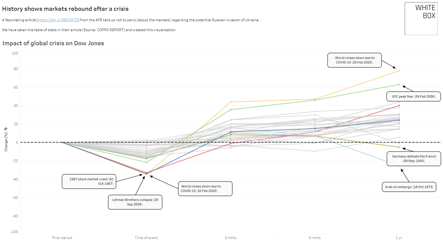
One of our core competencies at White Box is being able to turn raw data into something more digestible. So after reading an article on the AFR, we set about doing just that.
This is a fun way to explore the centuries of history behind data science.
Brought together by data iku, it explores the many people and moments in history that have defined this vast area of expertise!
From the early beginnings of Bayes’ theorem, right up to the more recent modelling that helped Pfizer-BioNTech develop the Covid-19 vaccine.
Given India’s reliance on coal - 70% of their energy comes from it - our data scientist Sai Diwakar took a look at some of the publicly available data to see how India is tracking and what’s involved for them to reduce their reliance on coal power.
This is our Junior Data Analysts experience with starting out with and learning Tableau. His main tips - engage the public community and practise, practise, practise!
Are all Customer Data Platforms (CDPs) made equal? What makes some CDPs better than others? We give our synopsis on these questions and why we’ve partnered with UniFida Australia to rid of some of the common problems that arise with ‘off-the-shelf’ CDPs.
What people like about AI Chat-Bots according to a US consumer survey, and how we use our own AI Chat Bot at White Box Analytics to help our visitors find answers to common questions.
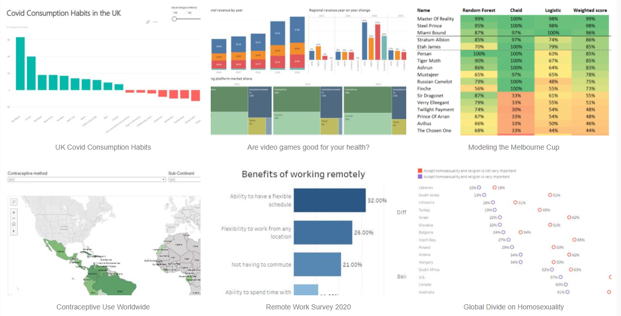
A Power BI visualisation showcasing how grocery product purchase trends have been influenced by coronavirus in the UK.


