Australian Mobility Insights from Covid-19
Covid-19 has brought significant damage to the entire world. From the deaths of thousands, to the rapid rates of unemployment we are seeing across global economies.
Of the countries across the globe, Australia has been on a relatively strong foot combating the viruses spread, with an effective lock-down regime seeing international arrivals being quarantined for a minimum of 2 weeks, and social distancing aiding the cause by preventing people from meeting in popular areas where the spread is most likely to occur.
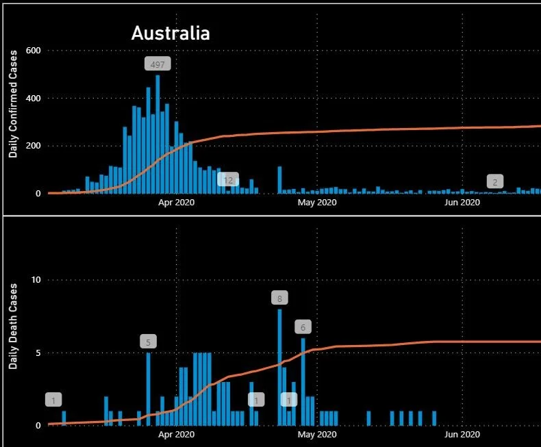
This narrative is reflected in the data we have seen presented to us in the news and other case studies, with a ‘flattened’ curve giving hope and allowing some more stringent lock-down conditions to be lifted. The below graph showcases the success of implemented measures since mid-April up to mid-June.
Despite this success, when we zoom out and re-focus on the present, this favourable situation has been majorly turned on its head, and has sparked a debate about individual states’ management of the virus and the related resources being employed to assist in containment.

Comparing the first and second graphs, we see previous daily case records being far outweighed by the latest statistics.
So, it is clear that Australia has not escaped the Covid-19 curse. But is this down to specific states not playing their part in the fight, or because of other factors?
Australian’s on Average Did A Great Job Distancing from Popular Communal Spots

The green trend lines above are derived from Google Mobility data, which all showcase Australians’ relative use of the specified locations, compared to a pre-Covid baseline levels. On average, we see a sharp decrease in public areas, particularly from March, followed by a slow, incremental rise back towards normality. The opposite was seen for residences, which was to be expected as people stayed inside and worked from home.
So, which states have suffered, and is there an obvious reason related to mobility we can draw out?
NSW and Victoria as the two states with the most concerning case numbers by far, so we’ll dig into these. For reference, as of 11th August, the two states make up 93% of total diagnosed cases.

NSW (yellow) and Victoria (green) cases.
This particular graph shows the numbers in Victoria in isolation, which, compared to NSW, are not looking like slowing down.
But have Victorian’s been irresponsible with their movements, and helped the virus to spread? Google’s Mobility Data suggests the answer is no. For the most part, Victorian’s have actually been more responsible than NSW residents, particularly in the more recent months.

Comparing the two states in retail and recreational area visits, this trend is relatively consistent, again with Victorian’s reducing their mobility slightly more.

So we can conclude that Victorian’s have absolutely been playing their part in stopping the spread up to this point.
Although the reasons for the second rising of the virus among communities is not 100% known, it must be noted that reducing restrictions must only come when a bullet-proof plan is established for individuals entering Australia, as well as for those travelling inter- and intra-state in order to prevent the exponential rise we have seen in so many other countries.
For more information on how to tell stories with data, please get in contact for a chat with us today.