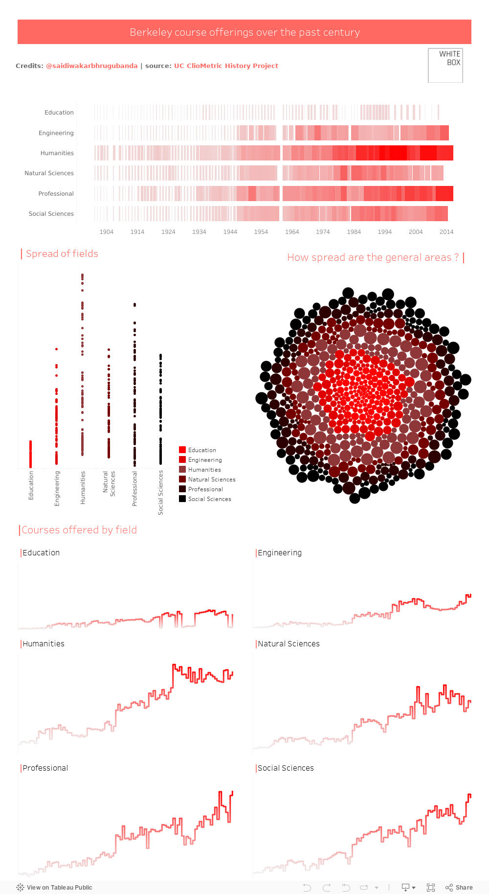
Berkeley Course Offerings - Makeover Monday
Over the past century, the professional landscape has changed profoundly. And with this change, has seen large changes in the courses offered in universities, including Berkeley in the US.
This Tableau visualisation gives an interest perspective on the courses that have increased their offerings, and those that have remained relatively stagnant in their growth.
We hope you enjoyed this visualisation. If you’d like to have a chat about visualising your own data, please get in touch with us today, or sign-up to our newsletter to get your monthly dose of the best things in the data-verse!
For more fascinating visualisations and data stories, click here.
To keep up with all things data and White Box, follow us on our LinkedIn page.
Featured


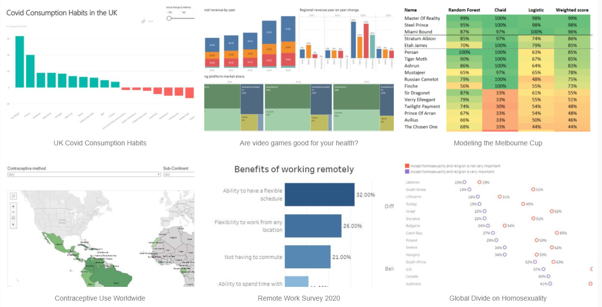
Top Picks