Mind the gap: the disparity in gender pay goes on
The gender pay gap is in constant debate, with the Government’s Workplace Gender Equality Agency stating that the current pay gap is 14.1%.

That’s a big percentage, which equates on average to $264 per week .
Imagine that – someone taking $264 out of your wallet every week, in essence because you don’t own a Y chromosome. It seems deeply unfair.
So, if reform is to happen, where do we start? It takes resources to bring about change, and if they’re misplaced, then the results could be disappointing.
To better our understanding, we decided to dig a little deeper using the 2021 Census data. There are many ways to analyse this concept, so we’ve taken a simple percentage comparison at wage band (given the gender split is roughly 50/50). Nationally, the pay gap clearly increases as the income rises.

Already we can see that the skew in salaries isn’t universal. We decided to focus on the higher earners ($2,000+ per week) to see how the high-income gender pay gap differs at the post code level within NSW.
We divided these into three pay gap brackets, in order to distinguish our “best” areas for equality (where the pay gap is <20%), areas approaching the norm across Australia (20-33%), and heavily male skewed areas (>33%).
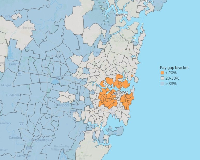
When we zoom into Sydney, an interesting story unfolds - the inequality of the gender pay gap moves roughly out from the CBD in ripples.
Why does this happen?
There’s no simple answer to that, and we can’t just leap right in. First, let’s start with a few hypotheses that will enable us to target some areas for investigation. To be clear, these are ideas, not statements of fact; they give us a launching pad into further phases of analysis.
Orange postcodes
There are more independent females in these high-cost areas, motivating stronger desire/need to push for higher salaries.
There are more highly-educated professional females in these suburbs who are better equipped to negotiate higher salaries.
In the professional roles occupied by these residents, there are more influential females in roles where salaries are being decided.
Grey postcodes
Moving into more family-oriented suburbs; women will take time out for parental leave, and face salary biases as mums returning to the workforce.
Blue postcodes
In an increasingly multi-cultural zone, a melting pot of cultural influences creates statistical skews towards males.
The decision-making management layer is more heavily male-dominated.
Looking at the whole of NSW, we can see that the male skew dominance isn’t persistent. There are clusters of better equality but the smaller sample sizes in regional Australia decrease the robustness of the outputs.

The insights made us keen to find out how some other capitals perform.
For Victoria, the high-income gender pay gap is slightly higher than NSW at 32.2%. As we zoom into the Melbourne area, the ‘ripple’ pattern is similar to Sydney, with the orange areas mainly in the more affluent postcodes east of the CBD.

In Queensland, the proportion of high-income pay gap is large (35.2%), and as we zoom into Brisbane, we can see the ripple pattern begin to fade. Why might that be? Brisbane is less affluent on average, so maybe there’s something to that theory. Or is it simply the effect of a smaller population, heading toward the mosaic pattern we saw for NSW? With the various hypotheses we have in play, we can test them between states to see what begins to emerge as a feasible truth.
And of course, it may be something we’ve yet to consider
A good analysis doesn’t strike gold on the first attempt; quite the opposite, we’d be careful not to simply accept the first plausible-sounding explanation. We would want to see how the patterns hold up if we continue to Adelaide, Perth, and other metros; as well as other cuts of the data, such as age group and industry.

Now that the ball is rolling, we’ll take that up for a follow-up article and see if we can cut to the heart of the issue.
In the meantime, what do you think? Feel free to share your thoughts on where you’d be looking next.
Explore more of our data stories:


