Coronavirus US Economic Impact Report - a synopsis
The US is now being called the epicentre of the Covid-19 pandemic, and with any global health threat, there are huge repercussions being felt by the economies of the people being affected it.
Yelp, a US based business directory service, is in a unique position to identify the key trends affecting local business and their subsequent industries. It has done this with a very simple yet powerful data visualisation that clearly communicates the beneficiaries of the US lock-down, and those most negatively impacted.
Check it out here (best viewed on PC/desktop):
White Box Synopsis:
We wanted to share this data because we believe it takes the huge mouthful of information that’s out there, and breaks it down into easily digestible pieces of information which gives viewers clarity and room for further research. One of the most important things in the data analysis industry, as well as more other industries, is to take complex information and make it more simple and understandable. Once you’ve found how to do this, you can truly start to make informed and powerful business decisions.
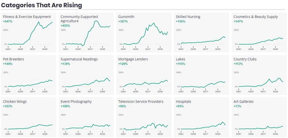
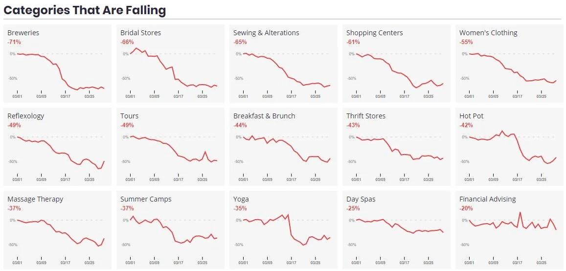
Can you spot any interesting trends in the above line charts? The categories that are falling seem to make sense with social distancing restrictions, although rising categories like community supported agriculture and art galleries seem a bit out of line…is this the result of causation, or is it just coincidental correlation?
For more fascinating visualisations and data stories, click here.
To keep up with all things data and White Box, follow us on our LinkedIn page.