This tableau visualisation explores the rise of women’s soccer in the US since 2003. A great visual display of the upward trend which has presumably been a strong influence in the success of the US women’s soccer team in recent global campaigns, including their win in the FIFA World Cup.
Read MoreWe use Tableau and Power BI to tackle a Makeover Monday data set on UK mental health statistics, incorporating figures from the original BBC article to draw out an interesting narrative. Telling stories with data is important for all businesses as it can highlight interesting insights and unlock new pockets of knowledge.
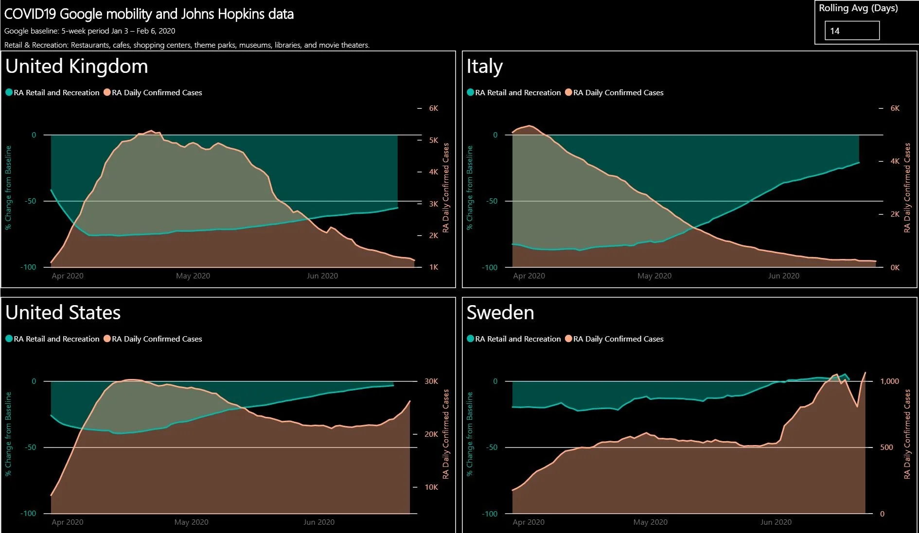
Read MoreHow can we measure the effectiveness of government lock-down restrictions across the globe in reducing outbreaks of the Covid-19 pandemic. We discover the effectiveness of individual nations’ lockdown restriction success by comparing global mobility trends with Covid-19 case numbers, utilising tools including Snowflake, Power BI and Excel which should be staples in any modern businesses data analysis.
Read MoreAmazon is one of the BIGGEST companies on the planet but has very small profits.
Read MoreLock-down measures were a theoretical strategy to contain and flatten the curve and to all extents, they “feel” like they’re working but can we prove it using data?
We have been analysing COVID country data since February and have now combined Google’s mobility data to give us a holistic view of emerging trends.
Read More


