Combining Covid & Google Data with Snowflake, Power BI, Excel and Google
Problem Statement
How can we measure the effectiveness of government lock-down restrictions across the globe in reducing outbreaks of the Covid-19 pandemic?
The Project
To discover the effectiveness of individual nations’ lockdown restriction success by comparing global mobility trends with Covid-19 case numbers.
How?
Establish a common connection between Google Mobility Report data (in CSV form) and John Hopkins University Covid-19 case data (in Snowflake data warehouse)
Extract, transform and load data to ensure data points can be matched for meaningful analysis and visualisation
Analyse and further transform data to understand the interaction between people's mobility and Covid-19 cases
Compare countries and do further exploratory research into government policies and regulations to ascertain successful and unsuccessful action taking.
The Process

Breakdown of Steps
1) Extract, Transform and Load
Download Google Mobility Report data and use the TRIM function within Excel to ensure clean data points that can be joined to the John Hopkins data set.
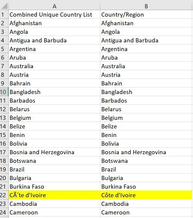
Create a new column to generate unique country names - those names with two names i.e. US and United States to be manually changed to ensure join can be made on country name AND date.
2) Power BI Processing
Connect to both databases through Power BI - for John Hopkins, connect to Snowflake data warehouse and for Google Mobility Report, create a live connection with the CSV link available on Google.
Join the 2 databases by date, and country.
Compute test line graphs of the data to ensure databases and data points are joining correctly. Analyse initial cross-over with trends between Covid cases and mobility trends.
Create a measure for rolling average within Power BI to smooth trendline and look for bigger overall trends.
Create a parameter for controlling the rolling average days with an adjustable filter between 1 and 90 day average.
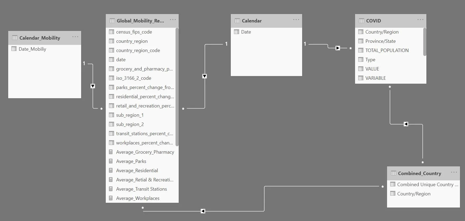
Creating the joins within the model
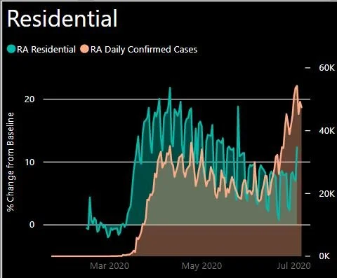
Volatile jumps between data points as displayed here were smoothed with the use of a rolling average.
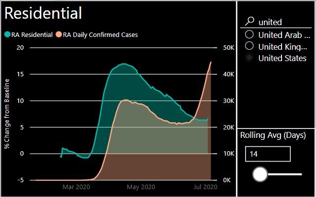
A two week rolling average highlights the trend more clearly.
3) Power BI Visualisation
Now the data is properly structured and connected with necessary additional measures and parameters.
Add a card which allows you to filter and search for specific countries.
Insert line charts for each of the key mobility categories.
Adjust the moving average parameter to ensure mobility category data does not deviate from normality.
4) Power BI Analysis
(Click here for the current analysis)
Monitor, analyse and compare countries of interest to understand trends of Covid cases and the mobility of populations.
Identify trends to drive further research and highlight successful countries versus those that are failing to manage Covid-19.
Challenges
In previous iterations, the data for Google Mobility was not dynamically updated, meaning we had to redownload the CSV, and update the CSV file feeding the data into the visualisation in Power BI.
With the established live connection, this is no longer necessary, and means issues relating to changes in the structure of the data are much more easily managed.
Summary
This is a type of analysis that many businesses need but struggle with creating due to the resources needed for and technicalities of the process. Coming from a relatively non-technical background, undergoing a process like this was a great exercise for myself to understand the intricacies that go into layered data analysis, and how tools like Snowflake and Power BI are friends, not foes, when it comes to getting insights to pressing questions.
In essence, looking at individual country case numbers in isolation is not as effective as consulting them with an understanding of the movements of their population, just as, for example, the value of a customer sale is more than likely influenced by the ads and messages that customer has seen prior to their sale.
Integrating data like this can give a single view of the potential influences of particular outcomes, which is far more powerful for understanding the dynamics at play and the strategies needed to provide greater value in future, whether that’s reducing the spread of a highly infectious virus, or providing a customer with a far better shopping experience.
Thank you for visiting White Box Analytics!
If you would like help collecting and organising your data to create insightful and dynamic dashboards and reports, please get in touch today for more information on ways we can help you.
To keep up with all things data and White Box, follow us on our LinkedIn page.