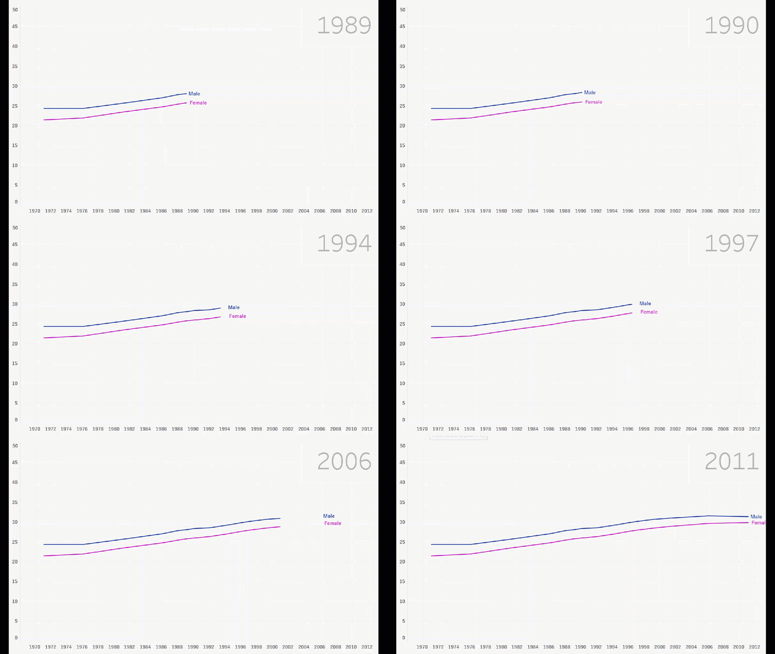
In this visualisation, Ije showcases one of the new Tableau features which allows for an interactive line chart to better visualise the trend present in the data. This particular visualisation explores the average Australian’s age when they get married, and how this changed between 1971 and 2011.
Read MoreIn Madagascar, Africa where particularly young women suffer from obstetric fistulas, rendering their child births agonizingly painful, and often leading to the loss of their babies. Operation Fistula aims to stop obstetric fistulas for all women, worldwide.
Read MoreDashboards are all about discovering insights from your data that you almost always cannot find by simply eye-balling it. Here are some of the top insights from our Top Rugby Players dashboard.
Read MoreThis weeks Monday Makeover Tableau visualisation shows beliefs about domestic violence and how they differ between genders around the globe.
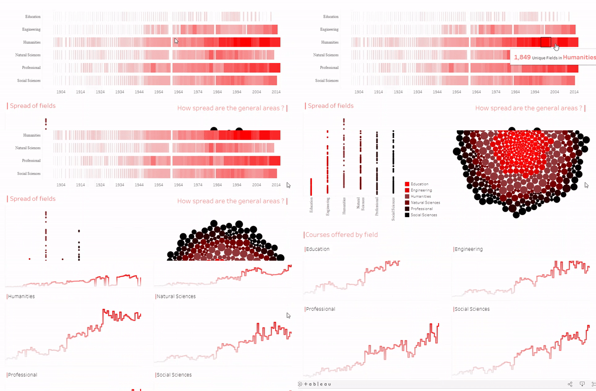
Read MoreThis weeks Monday Makeover Tableau visualisation shows how the number of courses offered in faculties at Berkeley have changed over the past century.
Read More


