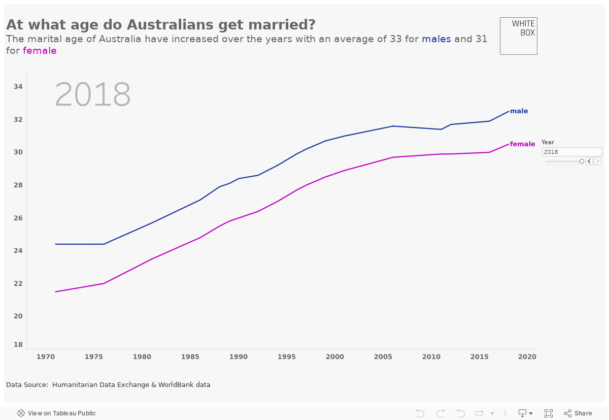
At What Age Do Australian's Get Married? | 1971-2018 | Visualise
In this visualisation, Ije showcases one of the new Tableau features which allows for an interactive line chart to better visualise the trend present in the data. This particular visualisation explores the average Australian’s age when they get married, and how this changed between 1971 and 2018.
Make sure to use the slider on the right hand side to see the trend in average age over time.
What else could this be used for?
Moving line graphs are a great way to showcase relevant business and KPI metrics. For example, following the launch of your marketing campaign, you might like to watch the trend in sales of a certain product being promoted within the campaign, compared to that of other products, on a day-to-day basis. An upward trend would suggest a successful campaign, whereas a stagnant line day-on-day may suggest the campaign isn’t doing what it was intended to do, sending the wrong message or delivering to the wrong target audience. Both outcomes allow you to assess the effectiveness of your marketing efforts and allow you to make clearer decisions about where to direct your efforts next.
Thank you for visiting White Box Analytics!
If you would like help collecting and organising your data to create insightful and dynamic dashboards and reports, please get in touch today for more information on ways we can help you.
To keep up with all things data and White Box, follow us on our LinkedIn page.