USA and the State of War - Visualisation
Some generations have known war all their lives. But which exact generations have really seen the most war over their relative lifetimes, and which generations have been the luckiest, and seen the least? Ije Ireumi created this interesting Monday Makeover visualisation to show you.

If we closely observe the trends there has been a steep rise in the percentage of war from 1974, resulting in 95% by 2000.
For more fascinating visualisations and data stories, click here.
To keep up with all things data and White Box, follow us on our LinkedIn page.
Power BI is transforming financial reporting by turning complex data into actionable insights. Discover five key practices to optimise data models, design clear dashboards, enable interactivity, automate updates, and maintain data security, empowering smarter business decisions.
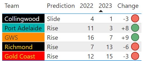
After a long off-season, the AFL season is here! What better way to celebrate than by making some bold, data-driven predictions about the biggest movers of the upcoming season.
The main obstacle with any developed data analytics function is the bottleneck of data and skillset – the more central intelligence you have, the more outer teams want to use it, so you need to find a way of allowing data and insights to flow.
If data is so complex that only your highly paid data wizards, how can make sense of it?
Here’s one methodology that we’ll discuss in detail, the Data Mesh:
A decentralised data structure with domain/product teams who own the analytical and operational data:
Self-serve infrastructure, data products and federated governance.
A data-driven decision-making culture across the organisation.
With the Oscars just round the corner (March 12th), it seems fitting to keep on top of the latest movies and see if data can help find the diamonds in the rough!
In my previous article I looked at upcoming sequels, with a lens of which movies would come out on top. A question that kept coming back was “can we predict how non sequel movies are going to do (rating wise)?”
Where there is data, we find an answer!
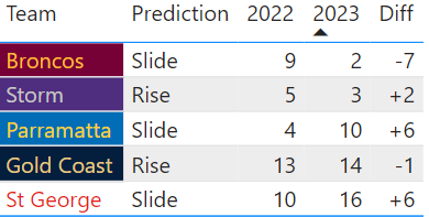
After a long off-season, the NRL season is here! What better way to celebrate than by making some bold, data-driven predictions about the biggest movers of the upcoming season.
The Australian Bureau of Statistics released the 2nd round of Census data on topics including employment and location-based variables in Oct2022. Our last article focused on the gender pay gap, so this time, we’ve used occupation data by age and gender to further enhance our understanding of this topic.
There are some BIG movies on the horizon this year – some where we know the characters like old friends and others that will introduce new heroes and villains (I really don’t know what to make of the new horror Winnie the Pooh movie).
The Christmas break offers so much - from family reunions, beach activities to stuffing ourselves with more food than would normally be appropriate.
If like me, you feel a bit overwhelmed by the choice of TV shows to catch up with, let’s use data to our advantage and make sure you cover off the biggest shows from the last few years!
Black Friday (25th Nov) is a global event and something consumers and retailers look forward to every year.
In the last 3 years, we can see how much Electronic goods and Clothing retail have really taken advantage of Black Friday and look to be outpacing Department stores for uplift.
We’re all aware that there is a gender pay gap but are certain areas more prone to it? We look at high earners across Australia using the 2021 Census data.


