The Novel Coronavirus - a Pandemic Disease Visualised
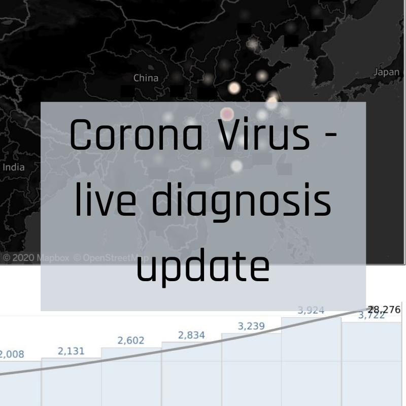
The Novel Coronavirus (2019-nCoV) has caused global alarm as the originally defined pneumonia cluster found in China has spread beyond its original source into upwards of 25 countries.
To keep you informed with the latest statistics on where it’s being diagnosed and how it’s being contained, the team at White Box Analytics have extracted the most up-to-date World Health Organisation data on the virus, providing you with an updated source on the numbers behind the virus.
Read More
Brexit and the next James Bond; how do they mix? - Visualisation
How do Brexit and the next James Bond character relate? Ije Ireumi’s Monday Makeover chart from a YouGov survey reveals Brits who voted to leave the EU do not wish to accept a non-british nationality, gay or female person playing the next James Bond character. Did you spot any other interesting insights in this data visualisation?
Read More
Harmful Pesticide Usage in the US - Visualisation
For our Monday Makeover, we explore the uses of dangerous pesticide ingredients in the US as compared to China, Europe and Brazil.
Read More
Sydney lock-out laws interactive map
In February 2014, Sydney introduced new laws to curb alcohol-fueled violence within Sydney CBD. Our interactive map allows you to assess pre and post crime statistics to make your own mind up on the impact the laws had.
Read More
Melbourne Cup Challenge
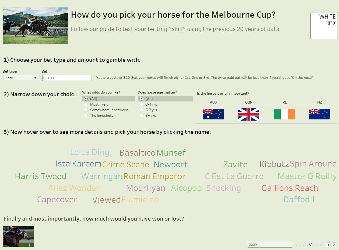
Flemington's annual Melbourne Cup is just around the corner. Each year punters use a host of strategies to pick a winner and impress their mates with their punting skills. This visualisation allows you to put your strategy to the test. Do you have what it takes to beat the bookie?
Read More


