In the beginning - there was data
Just over 1 year ago, my daughter Isabel arrived into the world at 8:22am.
Six hours prior, my partner Jo woke me up to tell me the contractions had started and (given this was our second) we started our planned routine of breathing exercises, soft music and using the shower on the lower back to reduce the pain.
Obviously, when I say “we”, Jo was doing the doing and I was providing support, talking with the midwife, keeping the shower head inch perfect on the lower back (it must not deviate!) and timing the contractions and waiting time between (data!).
It was only recently that I came across the data from this magical event, saved in my phone notes. As I always say to the team, there is data everywhere and you can analyse everything, so I got stuck into doing just that!
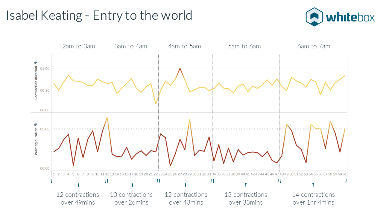
After spending some time remembering what the timings meant and a small amount of cleansing and data transformation, I created the below visualisation. It’s not an exact timeline, as I would have put down the phone and ignored timing for a number of reasons but it is accurate enough to retell the story.
The visualisation expresses the data by stacking two charts and using colour. The green part in the middle is the “Go Zone” - if we get contraction duration above 1 minute, time between less than 3 minutes, for about 1 hour, we head to the hospital!

For those that haven’t been through the experience, when the time comes, there are a number of rules to remember, the main one for us being the 3-1-1 rule. Head to hospital when your contractions happen at least every 3 minutes, last for 1 minute each, and have been happening consistently for at least 1 hour.
Note that this is different from the “norm” due to being our second child (usually 5-1-1).
As you can see, things never work quite as planned and although the contractions were coming thick & fast (less than 3 mins criteria), the contraction duration was consistently lower than 1 minute.

Probably the most interesting part is spotting the patterns of sustained calm (shower & music) and those when Jo wasn’t able to focus i.e. when she was helping to get Ella ready for nursery, what a superstar!
As you may have figured out by the timings, we didn’t make it to hospital. After waving Ella off with a friend who had come to look after her, Isabel almost made her entrance on New South Head Road next to our car.
Jo was in a state of complete inward trance, pretty much unable to communicate but keeping things together well. I on the other hand was struggling with two phones on speaker (midwife and ambulance), whilst attempting to persuade Jo to move back inside the apartment.
Finally we were able to do so, two ambulances arrived and two minutes later Isabel came into the world!
A massive thanks to NSW Ambulance service. They were incredibly good and gave us the time we wanted when Izzie first arrived.
If you’re interested in how my partner was able to meditate through the pain for 6 hours with no drugs, then chat with Kerry Sutcliffe, the Hypnobirthing mum, she’s ace.
Interested in the data and methodology? Read on
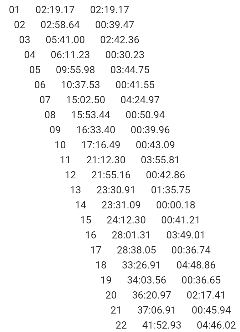
On the left, we can see the raw data copied from the timer app on my phone. On the right, the cleansed data and (data model) format I settled on.
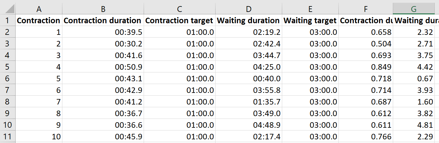
The data model is important, as it will make the visualisation easier to build. For something like this, it’s easy to test a format, build a visualisation and then rebuild the data.
Excel and Tableau work well together for exploratory work, giving you the option of testing different data models and visualisation techniques.
Using time variables can (and did) cause issues but thanks to the variable options within Tableau, there’s always a way to create the output you require (although I ended up converting to a numeric in Excel for ease later on).
As with all analysis, your mind evolves with every iteration. Below are some of the earlier ones as I got my head around the story I wanted to tell.

My initial visualisation that mistakenly showed both contraction and time between together.
Although pretty close to the final edition, the colours weren’t right and the annotations for the time blocks were stats based.
So what’s the most important part of data analysis? Understanding the data (discovery) and talking with those involved (stakeholders) to make sure you understand the context and story.
Read more data stories from the team:


