Data visualisation: more than meets the eye
Part 1 of a series
Perfection in simplicity
Every business understands that data is the most valuable asset today, as it’s the essential ingredient in drawing out key insights and learnings to make more informed decisions.
When data is presented in a visual medium, such as dashboard tools like Power BI, data can be interpreted more effectively.
However, poorly executed data visualisation will get you nowhere. Here we begin looking at best practices for data visualisation to help you draw the most out of your business’s data.
A little introduction
Antoine de Saint-Exupéry was a French novelist, poet, journalist, aristocrat, and aviator of the 20th century. Author of The Little Prince, globetrotting pioneer of international postal flight, political activist, shot down and killed as a WWII fighter pilot, celebrated national icon.
For a life so richly storied, there’s a wonderful phrase attributed to him –
“Perfection is attained not when there is nothing more to add, but when there is nothing more to remove”.
Less is more, as we might more succinctly say today. Antoine, presumably, would approve.
And yet, still we see many instances of this type of dashboard, below. If you can get something from it at a glance, you have quite the keen eye….
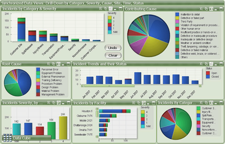
Of course, this demo is an exaggerated mess – there’s not enough space in this article to highlight everything wrong with it. So, let’s focus on the ‘less is more’ theme, or put another way, what would Antoine do?
Information overload
As a best practice, focus on what you need to show and make it easy to discern what the data is saying. After all, data is a means to an end. The temptation is to pack in as much as possible, with every detail seemingly indispensable.
In the design phase, especially when multiple voices are involved, it’s not unusual for the ‘must haves’ to build up and up until a 30-point wish list dictates the scope.
Then, you get data visualisation that is more intimidating than it is useful.
Instead, it’s important to step back and take a disciplined approach to prioritise content selection. The goal is, firstly, to have a goal.
What are we trying to achieve with the dashboard?
Who is the audience and what do they truly want from it?
What then will illuminate, not merely inform?
By asking these questions, we steer thinking toward high impact content delivering decision-influencing insight. Suddenly, the Revenue last 12 months and Category breakdown by type look like the classic fillers they are. To appease all stakeholders, those extra items can still be captured on supporting dashboards and drill-throughs.
In a perfect world, the target audience can look at a dashboard and take in everything they need to know to act, investigate, or maybe celebrate, in a second.
White space
It follows from reducing the amount of content that less of the available canvas will be used. Many will view this as sacrilege: why waste the space?
But this is like riding on packed public transport (remember those times?) – great for capacity utilisation but not much of a user experience. Dashboard elements are like those passengers, let them breathe!
The space between visuals is consistent with the high impact/low analysis objective of the previous section. White space (or whatever colour your dashboard background happens to be) allows the human eye the opportunity to distinguish between dashboard elements more easily and discern the difference in significance accordingly.
The other benefit of spacing is the polish that it adds to your dashboard design, enhancing credibility and thus engagement with users. The importance of thoughtful aesthetics shouldn’t be underestimated, and will be looked at more directly in a future piece in the series.
Colour palette
We all love a rainbow, it’s a true marvel of nature.
Sadly, they have no business in dashboards. While a mix of primary colours might work all right on some prominent tech world logos, they’re better avoided when considering colour palette design.
The first port of call is the client’s branding guidelines. Many will have them formally documented, but if not, their logo and website will be a good gauge of the right styling.
If the design is a genuinely open playing field, consider these pointers:
Look for complementary colours and use light contrast to expand the palette.
Avoid using vibrant colours or colours that tend to elicit meaning, such as primary red and green.
Have a maximum of 6 colours, if we’re keeping to the other disciplines we won’t need or want more than that.
With those in mind, a combination of blue/orange/grey is an example that can work well, with a secondary contrasting shade of each to fill out the range, e.g.

To stimulate ideas, try Adobe colour wheel, though it may end up creating more options than you thought possible!
CONCLUSION
Did any of these resonate with you?
There are many more considerations in building effective dashboards that will be looked at in future articles. However, it stands to reason that we start with content planning in order to avoid overload, focus on the things that matter, and minimise futile design work.
Stay tuned, The Little Prince shall return in the next instalment of the Data Visualisation Best Practice Series.
In the meantime…
We can help you make smarter, data-driven decisions.
White Box is highly experienced in providing data strategy, data science and data visualisation solutions.
As your data consultant partner, we’ll help you realise the full potential of your data and maximise your business success through advanced and innovative solutions that make all the difference.
Get in touch today for your free data strategy consultation.
Explore more of our data stories


