Data visualisation demonstration using the Marvel Cinematic Universe
Ever wondered who you are in the Marvel Cinematic Universe?
Are you an Avenger or Guardian of the Galaxy? Maybe part of the X-Force strike team?
With the release of Thor: Love and Thunder, we started asking ourselves who we would be if we found ourselves suddenly in the Marvel Cinematic Universe (MCU). Have you ever wondered the same thing, or are you just wondering what on Asgard we’re on about?
If you have even the tip of your little finger in the world of pop culture, you’ll know how dominant the Marvel Cinematic Universe has become over the past 10 years. With dozens of films spanning a massive, interconnected universe, the MCU has taken over Hollywood and grabbed the attention of millions of fans.
However, with such an immense catalogue of characters, keeping track of who’s who in the MCU, as well as their friends, allies, rivals and relatives, is a task too great for all but the most devoted fans.
That’s when we discovered our good friend, data, could give us a powerful gauntleted hand with this.
Now you can make sense of even Marvel with data visualisation
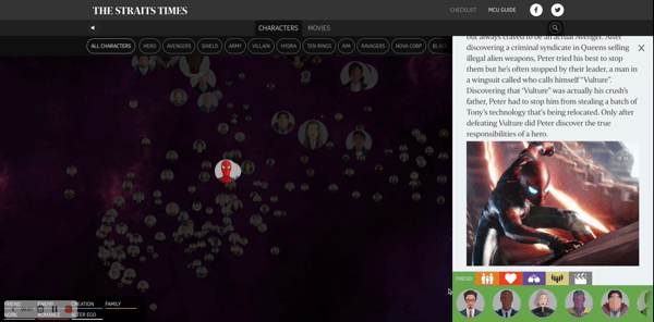
Luckily, we recently came across this interesting Marvel data visualisation that allows you to see how every character within the MCU connects to the others. This information is presented as a giant web through which you can pan and zoom in to see the details. But the best thing about this data visualisation example is the level of control that it gives you: you can filter by categories such as heroes or villains, and even what film they appear in, and the graphic adjusts to show you exactly how they’re all connected.
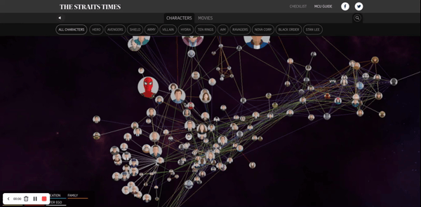
The reason we love this so much is because of how simple it is to comprehend.
You don’t need to spend hours wading through Wikipedia pages or watching endless YouTube videos just to understand the movies – with a few clicks, you can learn everything there is to know about a character and how they fit into the MCU.
The strength of this data visualisation example is that it turns something exceedingly complex and overwhelming into something straightforward and digestible. Long story short, it’s the easiest way to understand it all, and that raises an interesting point.
Understanding data is crucial to success - whether it’s for fandom or business
Now, we didn’t bring this up because we’re any sort of Marvel fanatic but because it illustrates an interesting point, and that is the importance of understanding your data. Think of the MCU as a massive dataset containing both quantitative (the number of heroes, villains, agents etc) and qualitative data (their backstories, relationships and rivalries).
In its raw form, the MCU data is basically indigestible to anyone who hasn’t seen every single movie and knows every single connection within them – and that’s the problem. You shouldn’t need to have collected all of the data firsthand in order to understand it, and without clear and effective insight, any value that the data has is basically lost.
This visualisation is a really great example of a social network analysis that uses nodes and links to present a set of interrelated data. The power and value of the visualisation is that it takes this formerly indigestible dataset and makes it easy to understand, even for someone who has never heard of Iron Man, Captain America or Pepper Potts.
Understanding your data will let you unlock its secrets
Although this data visualisation approach is often used in applications like social media, it can be used for any dataset as a way of understanding the interrelation between different data points. A common application is in customer-centric databases to see how the behaviour of one customer impacts others, or in basket analysis, to see which products are commonly purchased together.
The traditional way of understanding data is plotting bar graphs and scatter plots and letting them tell the story. However, modern tools are so much more powerful than what they used to be. The bar graph is still a familiar and reliable friend, but we’re always on the lookout for new ways to deliver visuals, and the road less travelled can unleash never before seen or even thought of angles on your data.
We specialise in data visualisation at White Box
It used to be that this sort of data visualisation and analysis was only available to multinational companies with large data science teams. But thanks to open-source algorithms and the growth of shared computing power platforms such as Google Colab, advanced data analysis has never been more accessible.
Data is essential to success in the modern world but without effective understanding, it can become a dead weight on the back of a business. Whether you’re a filmgoer wanting to make sense of the MCU or a commercial enterprise looking to gain insight into the behaviour of your customers, you need to understand before you can act.
Let’s start a conversation to see how we can empower your team
At White Box, we help bring your data to life so that you can make the right decisions that will benefit your business. If you’re feeling adrift in a sea of data and are looking for some guidance, talk with one of our team to tap into our knowledge of data science, data strategy and data visualisation solutions.
As your partner in data visualisation, we’ll help you to realise the full potential of your data and maximise your business success through advanced and innovative solutions that make all the difference.
Get in touch today for your free data strategy consultation.
Explore more of our data stories


