Survey insights dashboard
White Box is your partner in data visualisation

“Are you having issues making sense of your survey data?”
“Does your software struggle to combine questions and answers in the right way?”
If you're having these kind of issues, then talk to us about our survey insights dashboard product.
Overview
Surveys shine a light on what customers actually think about your product, company and/or service. They can provide a pulse of customer sentiment; a way of tapping into the mindset of how your customer perceives your brand.
So what’s not to love about surveys? Well, it turns out the data that comes from them!
We have had a multitude of businesses come to us with questions and issues about survey data, so we’ve created a product that answers almost all of them.
The problem
A common survey we see is customer feedback on a range of topics - such as shopping experience, customer satisfaction etc. Understanding your customers viewpoint on these things is essential.
However, problems start to arise when you look at the raw data.
Survey datasets are traditionally very wide with each question and answer stored as a separate column. When you have single vs multiple response questions, with different journeys for the customer to take all mixed together, these datasets become large and extremely complex to decipher.
Luckily at White Box, this doesn’t faze us and over the last 10 years, we’ve seen enough survey data to know how to get the best out of it.
The solution

Our data scientist has developed a standard data transformation and modelling process using Python.
This allows all types of question and response to be formatted perfectly for analysis and includes filters and slicers to optimise flexibility.
The output of this process is a standard set of data tables that tools like Power BI and Tableau love, rather than a single table with too many columns.
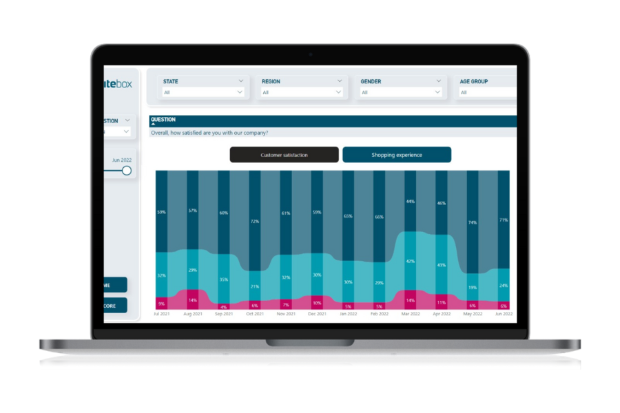
For this example, we are showing the Power BI survey product. This simplified version shows two tabs but yours could have many more.
The summary page highlights key questions, answers and trends. These are cherry picked for quick insights and show aggregated or top answers using colour formatting.

The detail page breaks down every question. There are many different ways to visualise this data but after extensive end user testing, our firm favourite is the ribbon chart, which represents the trend and changes on responses to each question.
The example here shows a negative swing in customer sentiment in March and April 2022 - probably due to a client price change.
The results
The below dashboard is interactive (best viewed on a laptop but mobile versions can be designed), so feel free to click on charts and filters to explore. You can change the date range or try the demographic filters on the top.
On the detail page, you can navigate around customer satisfaction and shopping experience questions to get a holistic view of the survey.
This survey insights dashboard is available now for you to fast track your insights! We understand that every company has different needs and requirements, so our data model is flexible enough to adapt to your world and our expertise in Power BI means we can customise the dashboard as well.
Want to know how your business could implement this solution? Contact us now to find out more.
Read more customer success stories
At White Box we have helped hundreds of clients make better use of their data - from impactful dashboards to machine learning algorithms that predict churn.
These showcase our expertise in Power BI, Tableau, Qlik and Looker Studio as well as our deep understanding of SQL, R and Python.